Case Study for Arbor Collective
Illustration | Layout Design
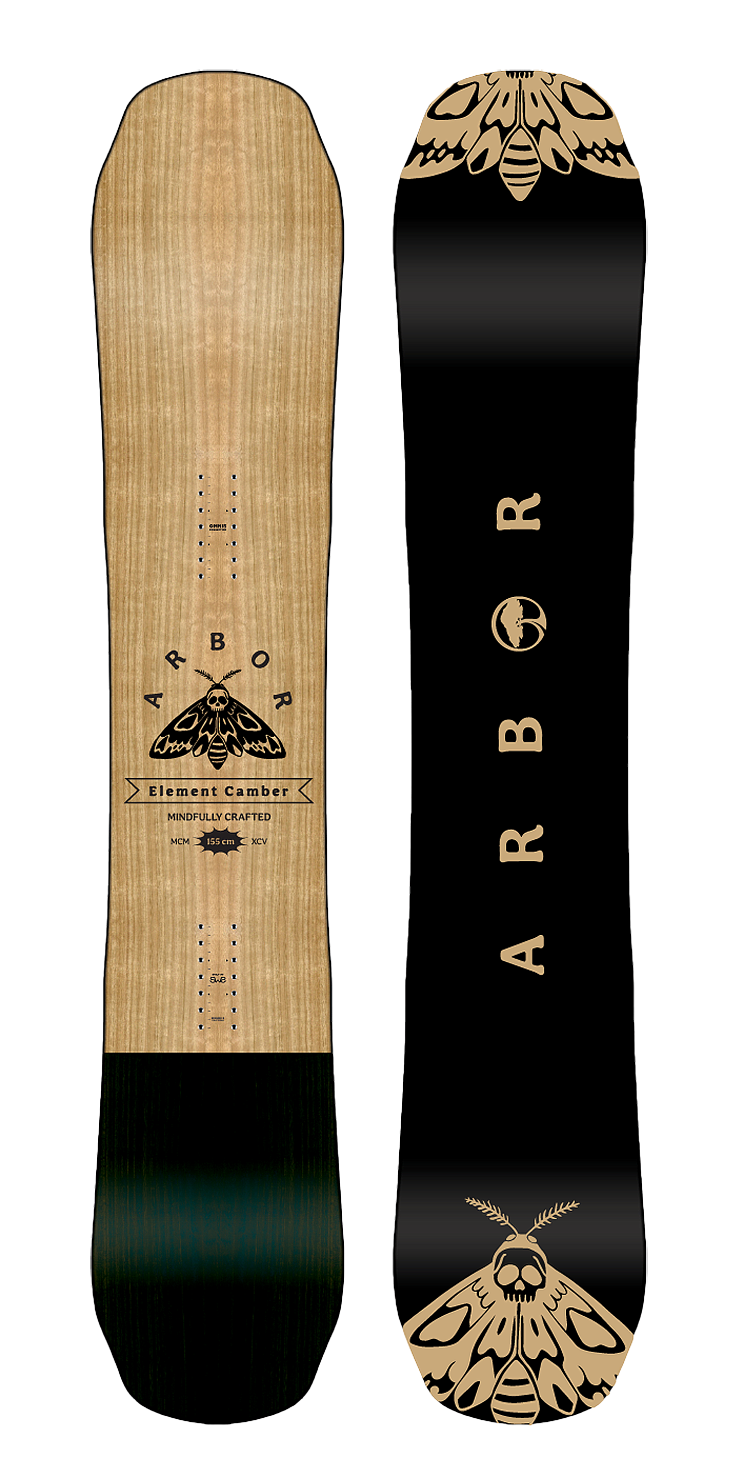
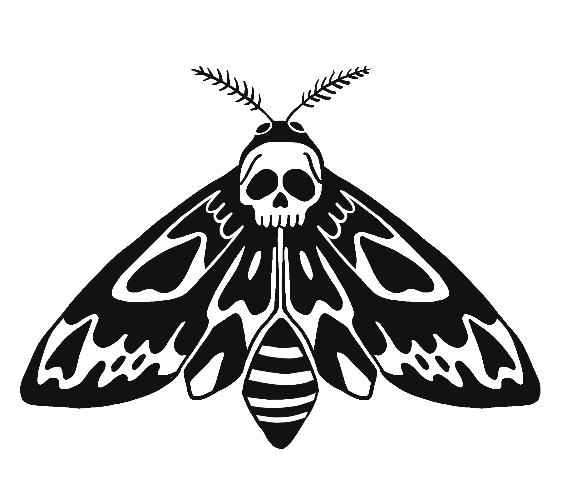
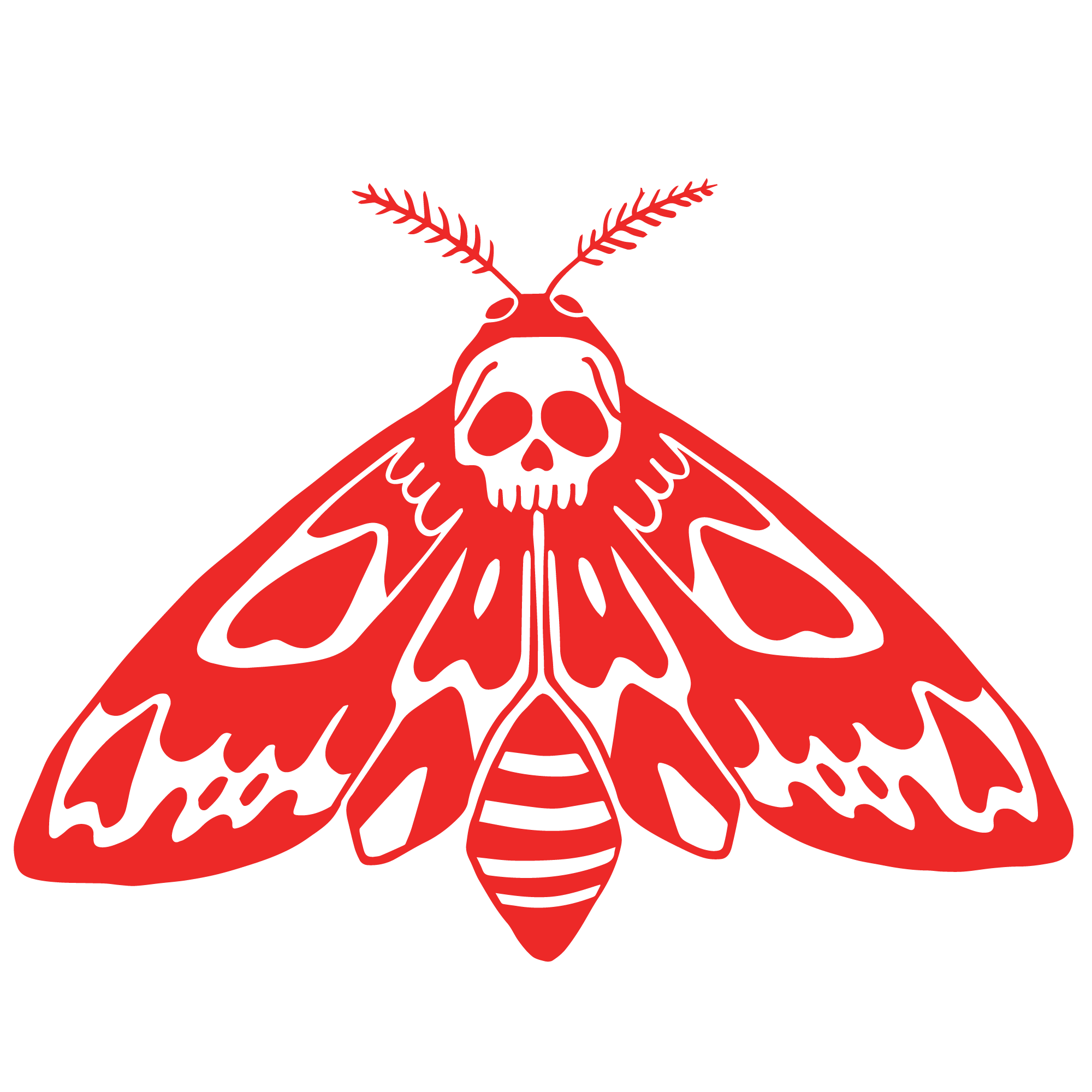
Brand specific Arbor Element snowboard inspired by the deaths-head hawkmoth. I kept the board simple to showcase the wood grain top sheet and illustrated the moth for a pop of playfulness. If you ask me this would make a great unisex board.
***Note: This is not a real project for Arbor. This was completed during my final round of interviews with them and I thought hey! I did all this free work, let’s show the people. Next time, I really don’t think any business should demand this much free work from potential employees.
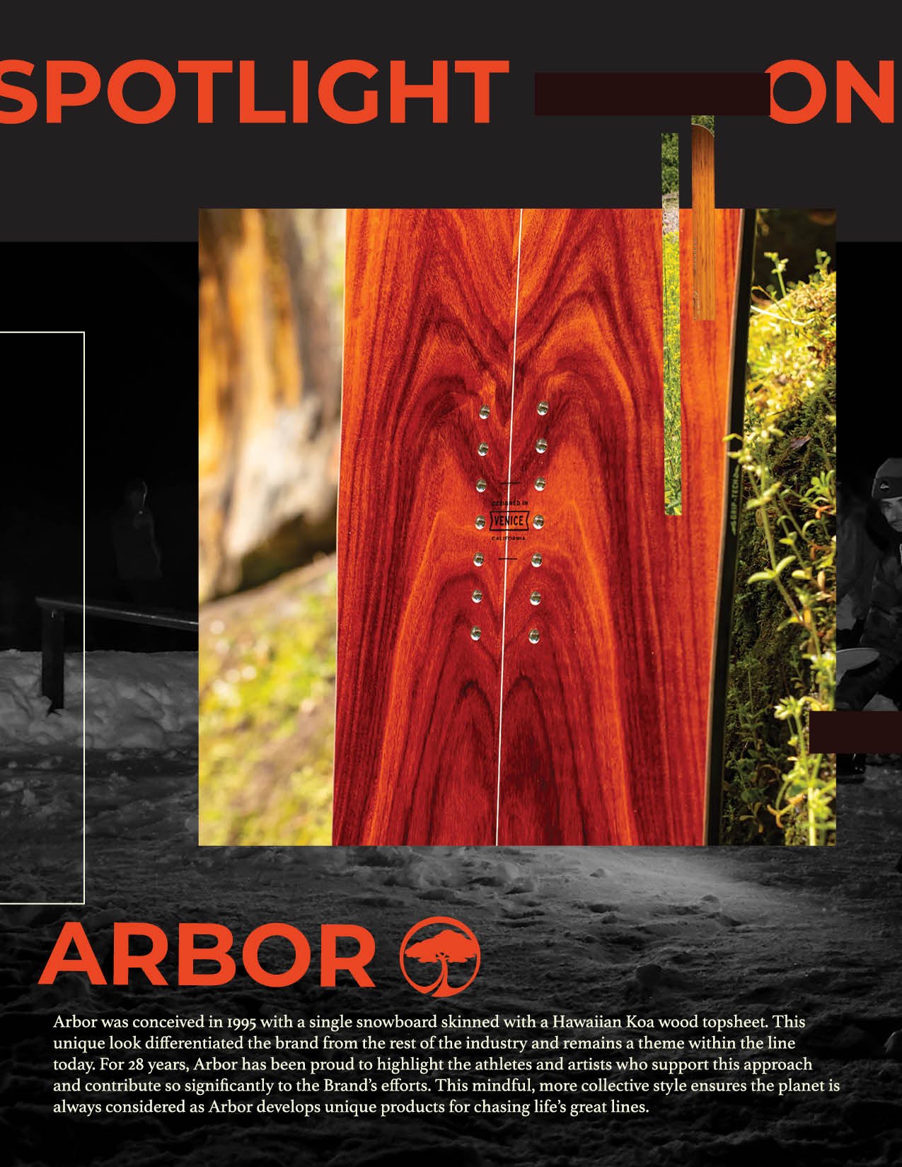
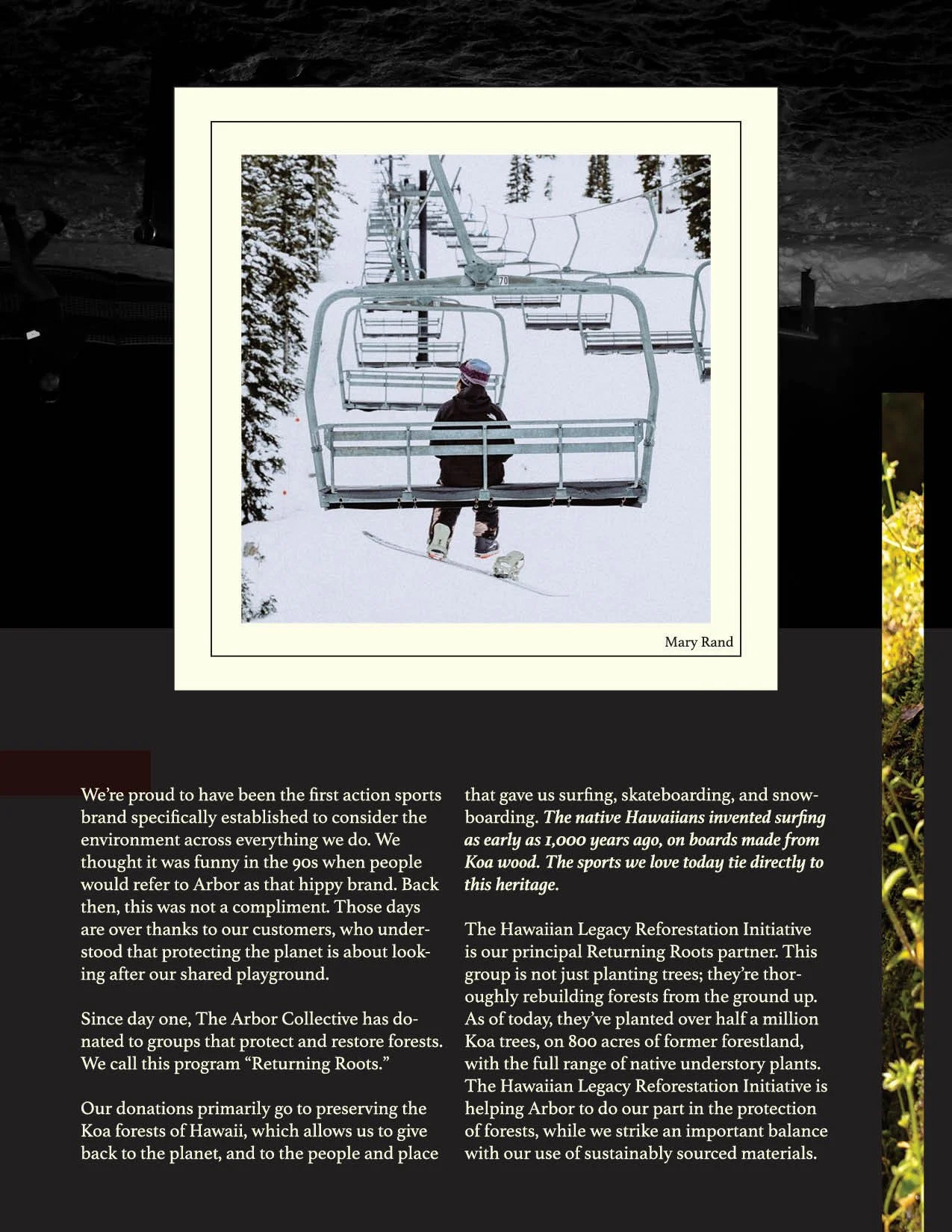
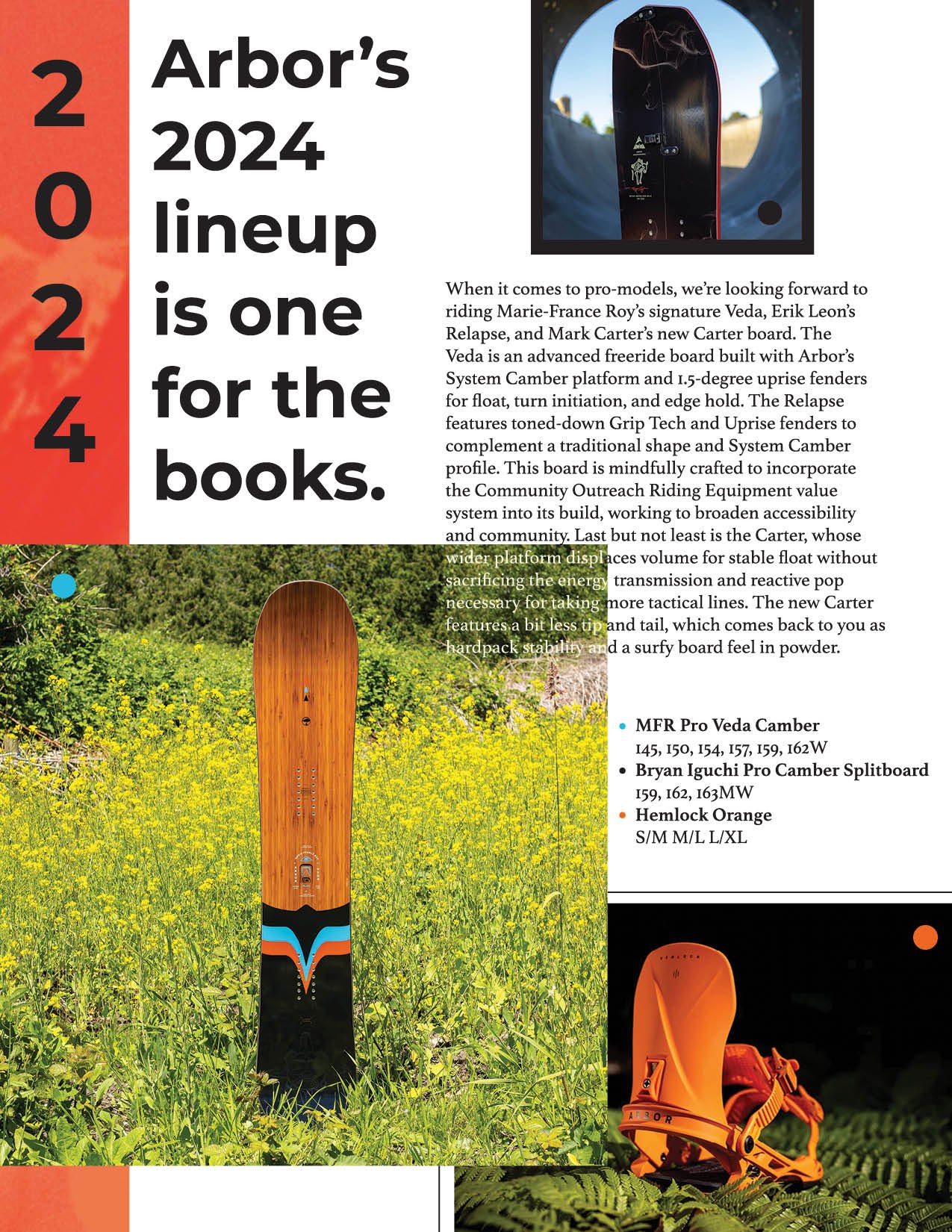
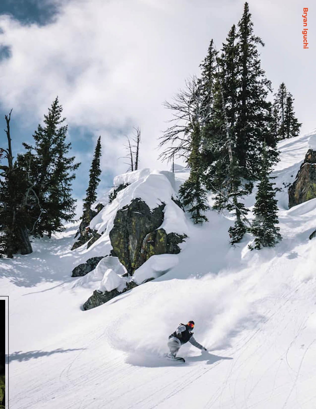
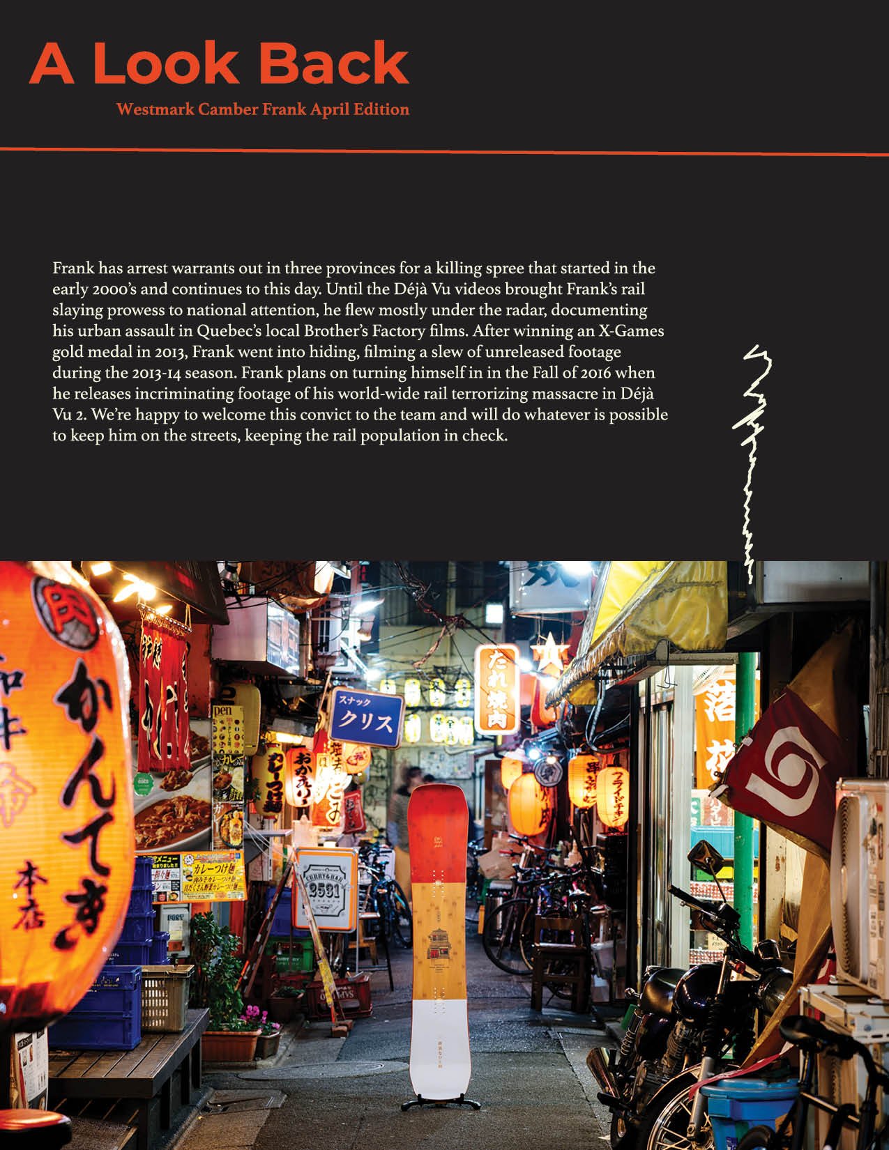
For this assignment I wanted to showcase my skills in Indesign by creating a wide array of layout options. I juxtaposed the dark snowy Snowboard mag inspired backgrounds with colorful nature imagery to maintain Arbors brand image.
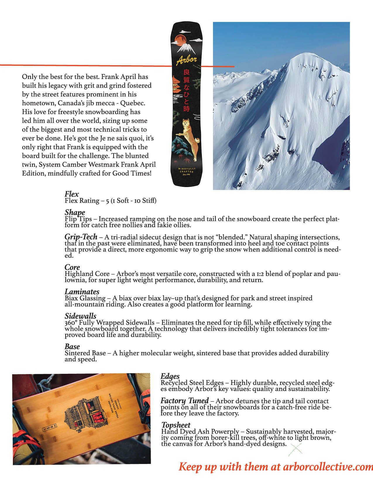
All images and text were pulled from online and I do not own any of them.
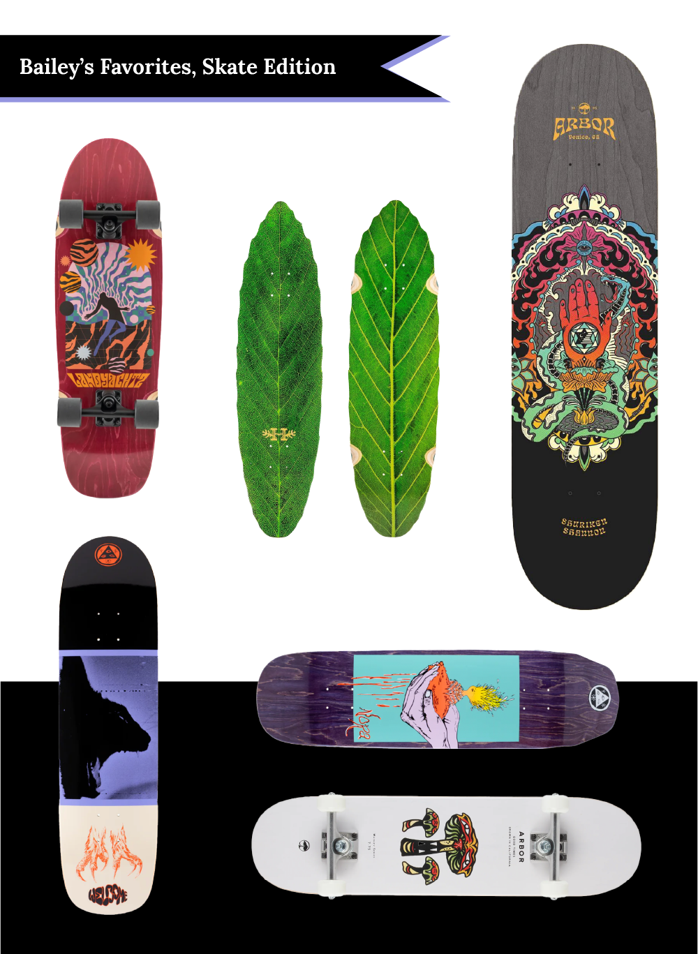
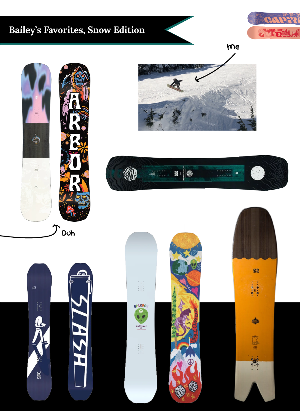
Skate + snowboard style references for Arbor.